¶ Description
Use a Chi-Square approximation to represent an aggregated matrix.
¶ Parameters
¶ Parameters tab
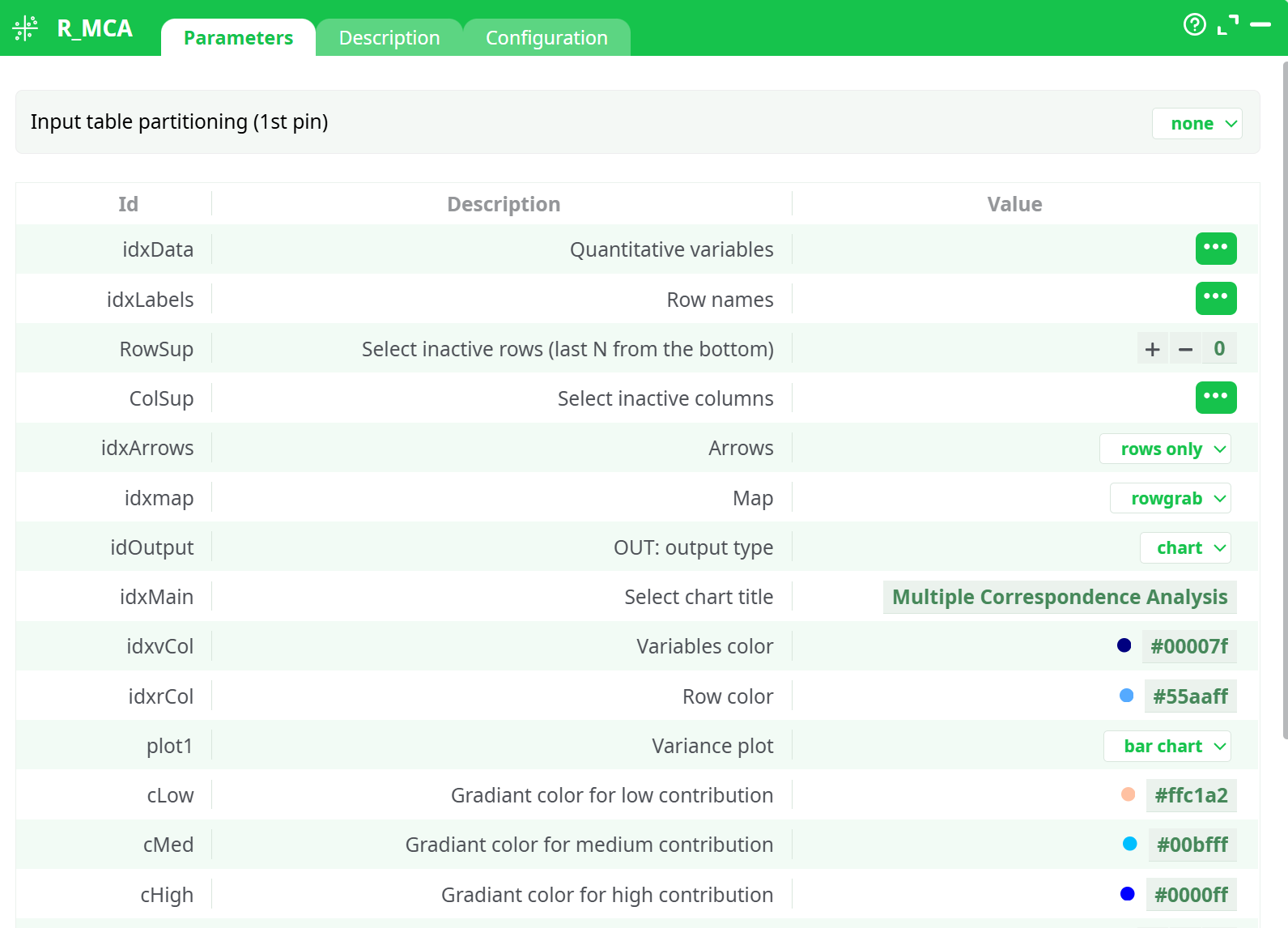
Parameters:
- Input table partitioning (1st pin)
- Quantitative variables
- Row names
- Select inactive rows (last N from the bottom)
- Select inactive columns
- Arrows
- Map
- OUT: output type
- Select chart title
- Variables color
- Row color
- Variance plot
- Gradiant color for low contribution
- Gradiant color for medium contribution
- Gradiant color for high contribution
- Medium point for contribution
- Scale of the X axis
- Scale of the Y axis
- Logo vertical position
- Plot size [pixel]
¶ Description tab
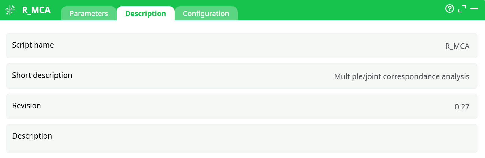
Parameters:
- Script name
- Short description
- Revision
- Description
¶ Configuration tab
See dedicated page for more information.
¶ About
Multiple Correspondance Analysis (MCA is a method often used in Market Research to understand the relationship between brands and attributes. It typically comes in the form:
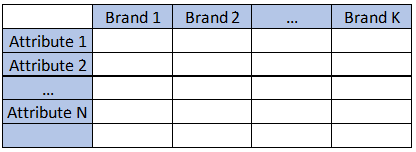
Where all the datapoints are average of the attribute for each brand, or frequency in which the attribute applies.
Multiple Correspondence Analysis is extensively discussed by Hoffman et al, and is a very popular technique in marketing research. Essentially, it is a multi dimensional scaling technique (MDS) that allows representation of multivariate data in a Euclidean space. Using this technique, one looks at the distance between objects to understand the characteristics of various brands on a market place.
While this method is often applied to plot proportions, it will also return valid results based in averages of data. Mapping analysis mostly relies on subjective interpretation of a chart, but the technique also offers metrics that allow us to estimate the validity of the map. The most important metric is the percentage of variance extracted (the amount of differences between brands and attribute correctly represented in the chart).
Scale of the variables is not that important but there MUST be a variance (if a row has identical values for all columns, MCA will fail)
MCA is somewhat related to factor analysis but uses a Chi-Square approximation of the distance, which tends to misrepresent distances near the center of the chart, and often tends to merge two dimensions in one.
-
Quantitative Variables: select numerical variables to include in the plot
-
Row Names: Column with row labels
-
Variables Color: Set the color to plot column positions
-
Row Color: Set the color to plot row position
-
Select Inactive Rows: Select the number or rows from the BOTTOM that will be ignored in the computation, but still plotted
-
Select Inactive Columns: Select the columns that will be ignored in the computation, but still plotted
-
Set chart title: set the main label of the chart
-
Gradiant color for low contribution: set the color to represent points that are poorly represented
-
Gradiant color for medium contribution: set the color to represent points that are “OK” represented
-
Gradiant color for high contribution: set the color to represent points that are well represented
-
Medium point for contribution: set the contribution to set the “OK represented” value (default is 1)
-
Arrows: select if you want to put arrows on columns variables, row variables, or both
-
Map: The default plot of (M)CA is a "symmetric" plot in which both rows and columns are in principal coordinates. In this situation, it’s not possible to interpret the distance between row points and column points. To overcome this problem, the simplest way is to make an asymmetric plot. This means that, the column profiles must be presented in row space or vice-versa. The allowed options for the argument map are:
- "rowprincipal" or "colprincipal": asymmetric plots with either rows in principal coordinates and columns in standard coordinates, or vice versa. These plots preserve row metric or column metric respectively.
- "symbiplot": Both rows and columns are scaled to have variances equal to the singular values (square roots of eigenvalues), which gives a symmetric biplot but does not preserve row or column metrics.
- "rowgab" or "colgab": Asymmetric maps, proposed by Gabriel & Odoroff (1990), with rows (respectively, columns) in principal coordinates and columns (respectively, rows) in standard coordinates multiplied by the mass of the corresponding point.
- "rowgreen" or "colgreen": The so-called contribution biplots showing visually the most contributing points (Greenacre 2006b). These are similar to "rowgab" and "colgab" except that the points in standard coordinates are multiplied by the square root of the corresponding masses, giving reconstructions of the standardized residuals.