¶ Description
Create a Plot with multiple series.
¶ Parameters
¶ Parameters tab
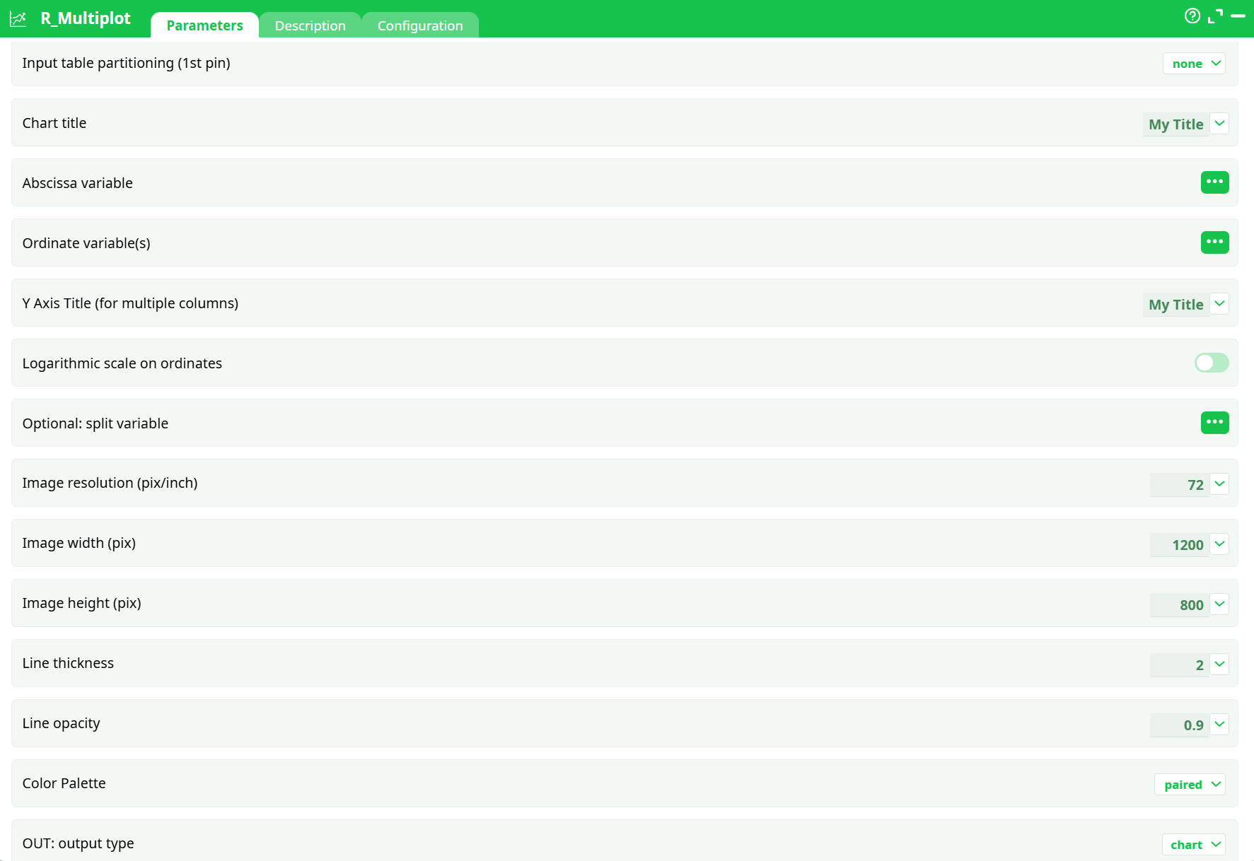
Parameters:
- Input table partitioning (1st pin)
- Chart title
- Abscissa variable
- Ordinate variable(s)
- Y Axis Title (for multiple columns)
- Logarithmic scale on ordinates
- Optional: split variable
- Image resolution (pix/inch)
- Image width (pix)
- Image height (pix)
- Line thickness
- Line opacity
- Color Palette
- OUT: Output Type
¶ Description tab
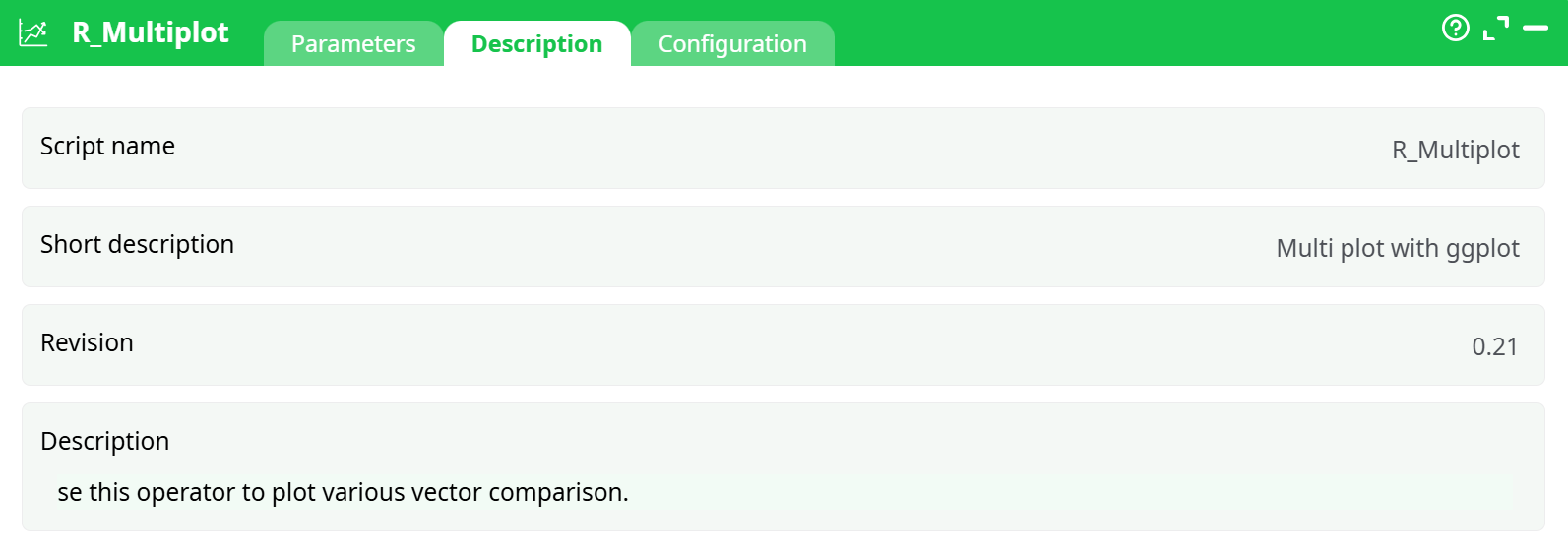
Parameters:
- Script name
- Short description
- Revision
- Description
¶ About
R_Multiplot draws one or many line charts from a tabular dataset using ggplot2 under the hood. You choose:
- the X column (time, number, or category),
- one or several Y columns (each becomes a line),
- an optional split (facet) column to create small multiples,
- visual options such as size, DPI, colors, opacity, line width, and log scale,
- and the output type: static image, HTML report, or interactive HTML.
It can render a single chart for the whole table or one chart per partition/iteration (when partitioning is enabled), and it supports common palettes for multi-series visuals.
¶ Prerequisites
-
Input table with:
- X column suitable for plotting (date/time, numeric, or categorical).
- Y columns as numeric values (one or more).
- Optional split column (categorical) if you want faceted small multiples.
-
For line charts to read well, the input should be sorted by X (ascending).
(There’s also an option that checks sorting in partition mode.)
¶ Input Requirements
- The first row should contain column headers.
- X: date/time, numeric, or text (categorical).
- Y: numeric columns only (each selected Y is plotted as a separate line).
- Split (optional): categorical column (e.g., product, region, scenario) to create one panel per category.
- If you enable log scale on Y, all selected Y columns must be strictly positive.
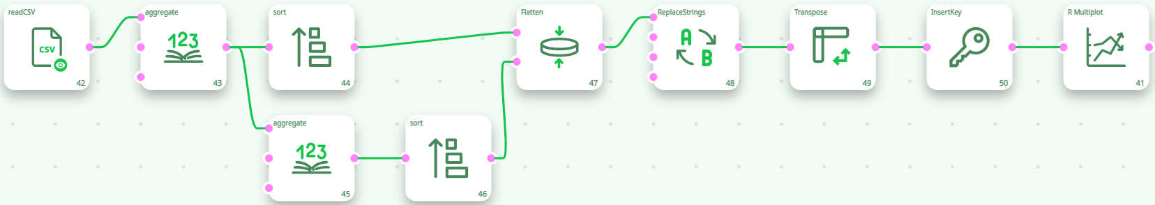
To obtain this data, we usually require a few transformations, as illustrated below. The data must be organized as one series per column, hence a transposition.
¶ Output
- Static chart (
chart): raster image (PNG) using width, height, DPI, palette, and styles. - HTML document: static HTML page embedding the chart (good for sharing).
- Interactive HTML document: interactive chart (hover/zoom/pan) suitable for reports and dashboards.
- When split is used, the chart is faceted into small multiples (one panel per split value).
- When partitioning is enabled upstream, the action renders one chart per partition.
¶ Use Cases
- Small-multiple dashboards using a split (e.g., product/region/scenario).
- Static report artifacts (PNG/HTML) or shareable interactive visuals.
- Batch rendering one chart per partition for automation.
¶ Troubleshooting
- Empty or broken plot → Ensure all selected Y columns are numeric and not entirely null.
- Jagged or crossing lines → Input likely unsorted; sort by X ascending.
- Log scale error → Some Y values are ≤ 0; turn Logarithmic scale on ordinates OFF or filter/transform upstream.
- Overcrowded legend → Too many Y columns. Reduce the number of series or facet with split.
- Too many facets → Large cardinality in split leads to tiny unreadable panels. Limit categories or partition upstream and render per group.
- Blurry export → Increase DPI and/or width/height.
- Color clashes → Switch Color Palette (e.g.,
spectral,pastel1) or usemanualif you need precise branding (define colors per series in your environment).