¶ Description
Create a Histogram chart from an already aggregated table.
¶ Parameters
¶ Parameters tab
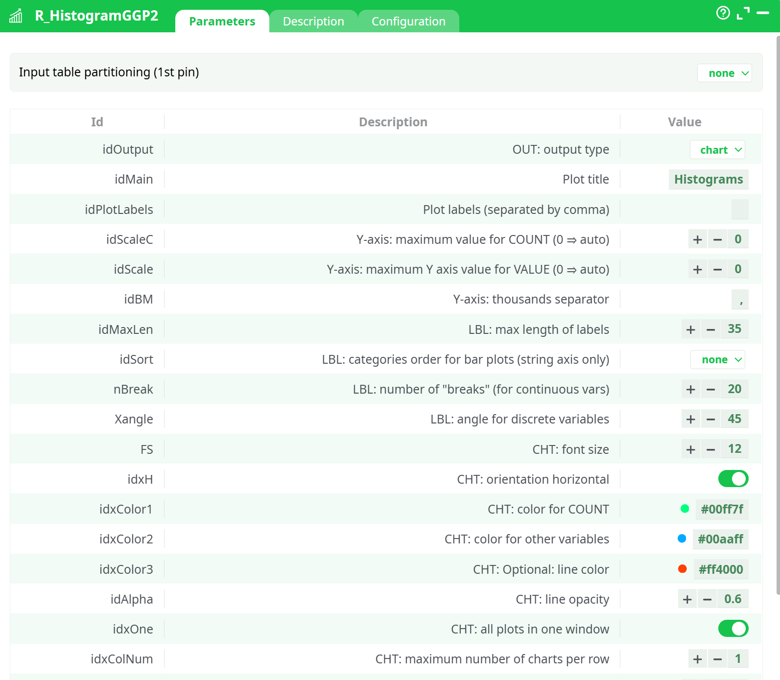
Parameters:
- parameters.R_HistogramGGP2.idOutput.desc
- parameters.R_HistogramGGP2.idMain
- parameters.R_HistogramGGP2.idPlotLabels
- parameters.R_HistogramGGP2.idScaleC
- parameters.R_HistogramGGP2.idScale
- parameters.R_HistogramGGP2.idBM
- parameters.R_HistogramGGP2.idMaxLen
- parameters.R_HistogramGGP2.idSort.desc
- parameters.R_HistogramGGP2.nBreak
- parameters.R_HistogramGGP2.Xangle
- parameters.R_HistogramGGP2.FS
- parameters.R_HistogramGGP2.idxH
- parameters.R_HistogramGGP2.idxColor1
- parameters.R_HistogramGGP2.idxColor2
- parameters.R_HistogramGGP2.idxColor3
- parameters.R_HistogramGGP2.idAlpha
- parameters.R_HistogramGGP2.idxOne
- parameters.R_HistogramGGP2.idxColNum
- parameters.R_HistogramGGP2.idxMargin
- parameters.R_HistogramGGP2.idW
- parameters.R_HistogramGGP2.idHt
- parameters.R_HistogramGGP2.myT0
¶ Description tab
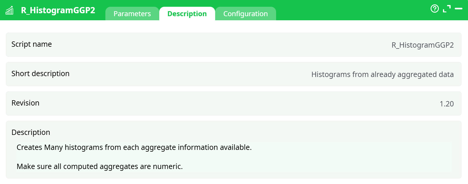
Parameters:
- Script name
- Short description
- Revision
- Description
¶ About
Each input corresponds to the results of and Aggregate action. If you add a third dimension, it will automatically be set as a line.
Parameters:
- Y Axis Maximum value: set the maximum value on the plot, so you can compare all your variables on the same scale.
- Y Axis thousands separator: what character to uso to display the thousands
- LBL Max length of labels: maximum number of characters displayed
- Orientation: By default, histograms are verticals (categories are on the X axis). Use this option to put the categories on the Y axis
- Color for COUNT: select the color for a simple count
- Color for other variables: select the color for double values (mean, stdev, etc.)
- One window per input pin: if you have multiple charts, you may display them in a single window.
- Maximum number of charts per row: if you selected the previous option, how many charts can fit in a row.
- Margin between charts: set the parameter to make charts easier to read.
- Font Size: set the font size (default is 0.8)
- Save Images as PNG: choose whether to save the output as a PNG file or not
- PNG Directory: choose where to save the file (by default in the active directory “
 ”)
”)
Example
Using the Census Database, we want to make histograms of the difference in wage per hour, for each education level, We will first make an aggregate to compute the values to display:
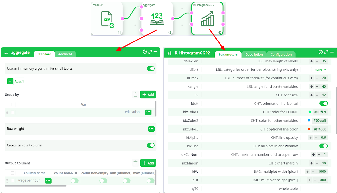
.. and set the proper parameters to display the histogram. In this case, we simply modified the default value of “Chart Margin” to properly display the labels of the
education levels, which can be quite long.
This automatically generate the following plots. Note that we chose to keep all plots in the same window, in many cases it is preferable to have one single plot per chart. To do so, simply unckeck the option “All plots in one Window”. You can add up to 20 aggregations in a single “histogram plot”.