¶ Description
Display (and optionnaly compute) a clustering using Self-Organizing-Map.
¶ Parameters
¶ Parameters tab
Parameters:
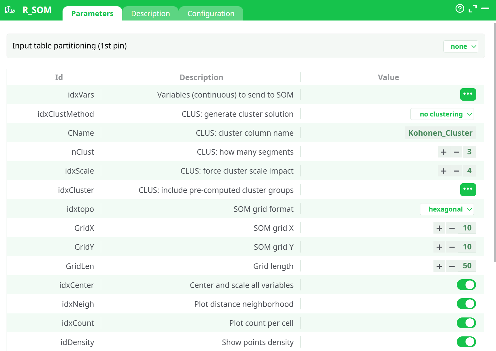
- Input table partitioning (1st pin)
- Variables (continuous) to send to SOM
- CLUS: generate cluster solution
- CLUS: cluster column name
- CLUS: how many segments
- CLUS: force cluster scale impact
- CLUS: include pre-computed cluster groups
- SOM grid format
- SOM grid X
- SOM grid Y
- Grid length
- Center and scale all variables
- Plot distance neighborhood
- Plot count per cell
- Show points density
- Show "Pie" visualization
- Generate one window per chart
- Number of charts per row
- Number of rows per plot
- Seed
- Within-borders
- Plot grid format
- Variable list from input
- All columns
¶ Description tab
Parameters:
- Script name
- Short description
- Revision
- Description
¶ Configuration tab
See dedicated page for more information.
¶ About
This Action is mainly for explanatory/teaching purposes. If you want to create a better segmentation, you should use Stardust.
SOM (Self Organizing Maps), or Kohonen Maps, are a crude form of dimension reduction. The multivariate space is reduced to two dimensions with a preset number of ordinal categories, and the density is then represented by a heat map.
The objective of the SOM action is, mainly, to illustratre, using nice colors, some meaningful segments created with another segmentation algorithm (such as K-means, Wards, etc.). Do no use the SOM action to actually compute any segmentation because it will most likely find a segmentation that does not really exists in your dataset (i.e. the SOM algorithm is one of the worst algorithm that you can find to discover the true segments hidden in your datasets). In this implementation, we are using the CLASS and KOHONEN packages in R, which allow for the following settings:
Variables (continuous) to send to SOM: select the variables on which to compute the Kohonen space. The variables must be numerical
Generate Cluster Solution:
- NO Clustering: this will generate a neat Kohonen map, nothing tricky about it.
- Apply Cluster Variable: the space generated in step 1 is respected, but we will apply the cluster membership from the previously computed segment
- FORCE Cluster solution: we will force the segment structure to affect the kohonen space, ensuring segments are well represented, but at the cost of a harder to read map
- Compute from SOM: this will run a hierarchical clustering on the available data, respecting the original Kohonen space, but at the risk of having segments that may not exist. DO NOT USE THIS OPTION since it will generate poor quality segments.
How Many Segments: Select the number of segments to compute. If you force a variable, this value is overruled.
Include Pre-computed cluster group: Select the variable with (numerical) cluster membership
Center and scale variables: self explanatory. Although this feature is mostly used when variables are on different scales, it usually gives better maps when used.
SOM Grid Format: Select the topologuy of the SOMGRID object, Circular or hexagonal.
SOM Grid X: Select how many nodes will be included on the X axis.
SOM Grid Y: Select how many nodes will be included on the Y axis.
Grid Length: the number of times the dataset will be presented to the network
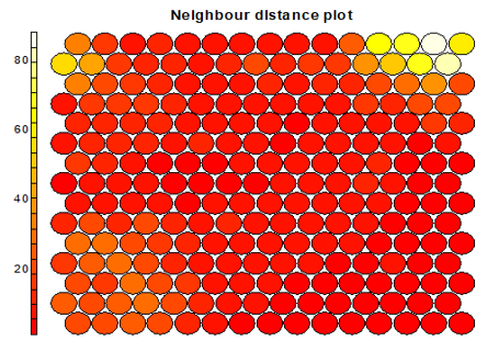
Plot distance Neighborhood: choose wheter to output the distance plot. Plot show how distant each node is from its neighbors. In this example, the lighter the color, the larger the distance, hence the first two nodes of the second line, and the last 4 nodes of the first two lines are relatively far from the rest of the distribution.
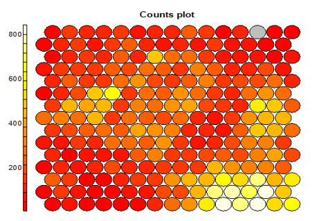
Plot Count Per Cell: each node typically includes a variable number of respondents (records). This chart give a good feel of how unbalanced the map is. The lighter the color, the higher the number (the lower right portion has cells of over 800 records, while the left corners have small groups of less than 200 records)
Generate One window Per Chart: Select if you want each variable in a separate map, or a map with all the variables next to one another
Number of charts per rows: if you did not select the previous option, this sets how many chart per rows will be included in the plot window.
Seed: set the random seed so you can reproduce the exact same map, or set other starting value if you do not like the results.