¶ Description
Display a Scatter Plot.
¶ Parameters
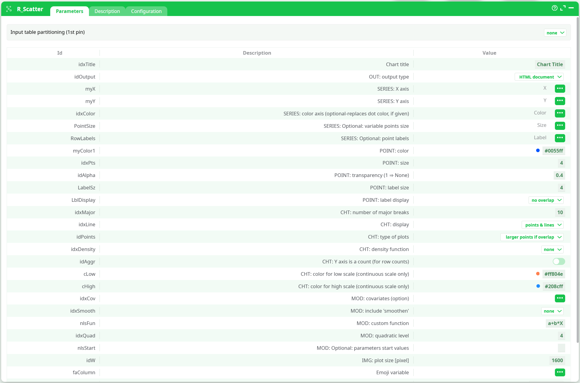
¶ Parameters tab
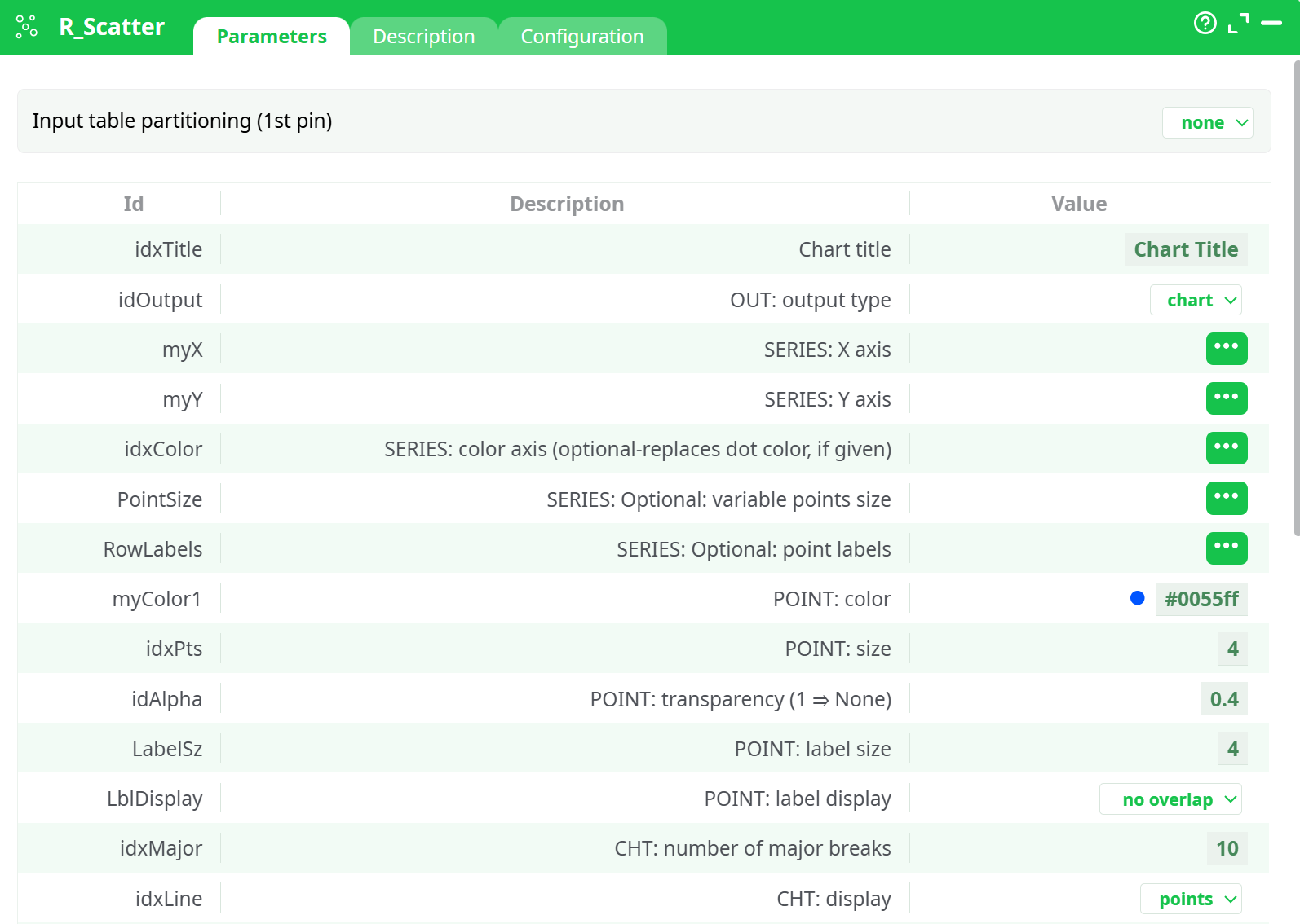
Parameters:
- Input table partitioning (1st pin)
- Partitioning column
- Chart title
- OUT: output type
- SERIES: X axis
- SERIES: Y axis
- SERIES: color axis (optional-replaces dot color, if given)
- SERIES: optional variable points size
- SERIES: optional point labels
- POINT: color
- POINT: size
- POINT: transparency (1=None)
- POINT: label size
- POINT: label display
- CHT: number of major breaks
- CHT: display
- CHT: type of plots
- CHT: density function
- CHT: Y axis is a count (for row counts)
- CHT: color for low scale (continuous scale only)
- CHT: color for high scale (continuous scale only)
- MOD: covariates (option)
- MOD: include 'smoothen'
- MOD: custom function
- MOD: quadratic level
- MOD: optional parameters start values
- PNG: plot size [in pixel]
- Prediction data
- Emoji variable
- Emoji theme
- Emoji color
- Emoji Transparency Level
¶ Description tab
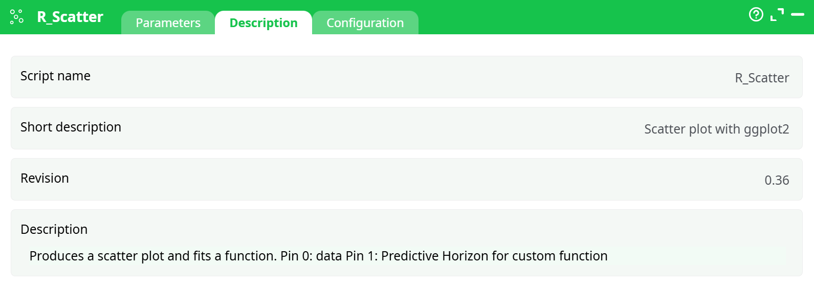
Parameters:
- Script name
- Short description
- Revision
- Description
¶ About
The R_Scatter action button generates interactive scatter plots from tabular data using R (via ggplot2). It allows customizable axes, point size and color, label options, smoothing lines, density functions, and emoji theming. The chart is rendered in an HTML format for interactive exploration.
¶ Input
Input must be a structured table with numeric and/or categorical columns.
Required columns:
X: numeric column for X-axisY: numeric column for Y-axis
Optional columns:
- Color variable
- Size variable
- Point labels
- Covariates
- Emoji labels
Input CSV placeholder:
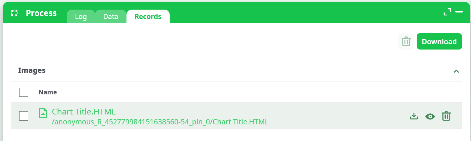
¶ Output
- Format: HTML chart (interactive)
- Location: Records tab >
Chart Title.HTML - Features:
- Hoverable tooltips
- Color gradients
- Smooth regression lines
- Emoji visual mapping
¶ Parameters
Parameter configuration :
¶ How to Run
-
Upload a CSV with at least numeric
XandYcolumns. -
Connect it to the
R_Scatteraction in your pipeline. -
Configure:
- Chart Title: Enter a name for the chart.
- Output: Select
HTML documentetc. - X/Y Axis: Assign numeric columns.
- (Optional) Add label, color, smoothing, emoji, and styling options.
-
Run the pipeline.
-
Go to the Records tab and download
Chart Title.HTML.
Process and download:
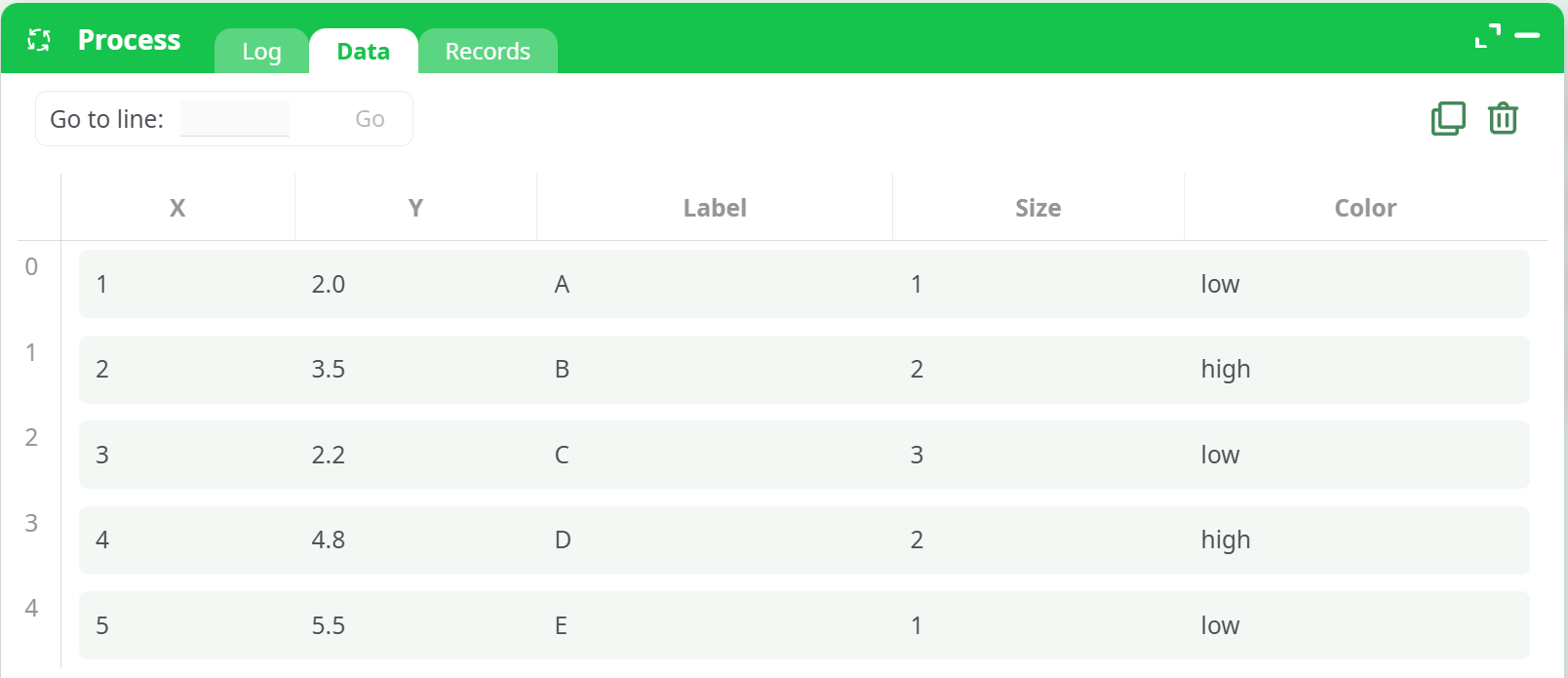
¶ Example
¶ Input Table
| X | Y | Label | Color |
|---|---|---|---|
| 1.0 | 2.0 | A | low |
| 2.1 | 4.0 | B | high |
| 3.2 | 2.5 | C | low |
| 4.4 | 5.0 | D | high |
| 5.0 | 6.0 | E | low |
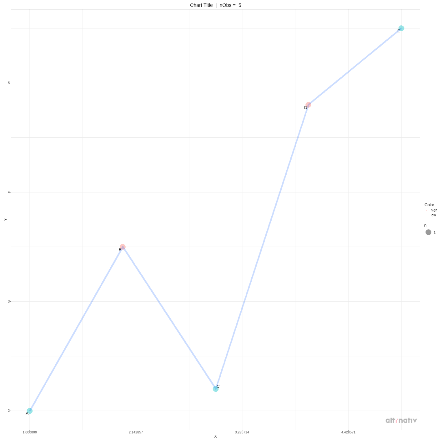
¶ Output Chart
An interactive HTML scatter plot with color gradient, point labels, line smoothing, and hover interactivity.
¶ Use Cases
- Sales trend analysis: Plot quantity vs time, highlighting seasonal trends
- Customer segmentation: Visualize behavior across product features
- Experimentation: Compare test/control metrics with smoothing for clarity
¶ Advanced Features Explained
- Density Function: Highlights bivariate data concentration
- Color Axis: Visualizes third variable as color
- Smoothen Line: Adds a regression line (linear, quadratic, or custom)
- Y Axis as Count: Enables aggregated plots like demand curves
- Emoji Mapping: Adds emoji visualization based on categorical fields